The world of spatial design and architecture is experiencing a renaissance, driven by an ever-evolving blend of creativity, technology, and a deepening understanding of human needs. This industry, crucial in shaping the environments where we live, work, and interact, has become more relevant than ever in today’s fast-paced, ever-changing world. The rise of sustainable practices and the push for inclusive designs are transforming the way spaces are conceptualized, highlighting the profound impact of design on societal well-being and environmental harmony.
Asmita Kerkar, a talented spatial designer and architect, epitomizes this new wave of design thinking. With a keen eye for both aesthetics and functionality, Asmita’s work goes beyond mere structure and form. It’s a reflection of her aspirations to harness design as a tool for social change and community enrichment. Her skills, honed through diverse experiences ranging from urban planning to trauma-informed design, are complemented by a passionate commitment to sustainability and inclusivity. Asmita’s career, marked by notable projects and features in esteemed publications, showcases a trajectory that’s not just about building spaces but about crafting experiences that resonate deeply with the human spirit.
This introduction is just a glimpse into the world of Asmita Kerkar. As we delve deeper into her journey, insights, and the stories behind her transformative projects, readers are invited to explore the rich tapestry of her work. Stay tuned for an enlightening conversation that reveals the depth and breadth of her expertise, her vision for the future of spatial design, and how she is actively shaping the world, one space at a time.
Table of Contents
We’ve been looking forward to this conversation, Asmita! Tell us, how do you decide what projects to feature in your online portfolio, and what do you hope they collectively say about you as a spatial designer and architect?
In curating my portfolio, I carefully select projects that resonate deeply with community needs. These aren’t merely aesthetic endeavors; they’re research-driven and focused on tackling societal challenges. My approach goes beyond creating visually appealing designs. I aim to feature projects that underscore my dedication to designing solutions collaboratively and participatively. The primary goal for my portfolio is to mirror a designer who values understanding and working alongside communities, prioritizing functional solutions over just aesthetic attractiveness.
Your website emphasizes the transformative power of design, especially in relation to social change. Can you talk about a project featured on your site that you feel best exemplifies this philosophy?
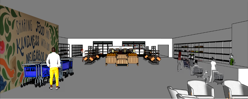
My design philosophy for food shelves is anchored in dignity, community, and creating a safe space for shoppers, perfectly aligning with the concept of using design for social change. Transforming these spaces from mere functionality to inviting environments stands as a strong testament to design’s influence on human experiences. Presenting before-and-after images, coupled with the principles guiding my designs, serves as an exemplar within the industry. This practice not only inspires similar transformations but also propagates the notion that spaces dedicated to support and aid should be designed thoughtfully, respectfully, and empowering for their users.

You’ve been featured in multiple publications. How did these opportunities come about, and what impact have they had on your career?
Being featured in various publications has been an unexpected and incredible boost for my career. A lot of these opportunities arose from the support of amazing colleagues and peers who believed in my work. Their nominations of my projects eventually attracted the attention of these publications.
The impact has been phenomenal. These features have opened doors to collaborations with like-minded individuals and provided a fantastic platform for expanding my network. But the coolest part? The feedback I’ve received. Constructive criticism from experts, readers, and fellow designers has been invaluable. It’s like gold! This feedback has allowed me to refine my projects, push creative boundaries, and continually aim for higher standards in my designs. It’s akin to having an ever-evolving guidebook for crafting new projects.
How important is your online presence, specifically your website, in acquiring new opportunities or clients? Can you share any instances where your online portfolio directly led to a new project or collaboration?
Establishing a strong online presence, particularly through my website, has been pivotal in seizing opportunities and forging collaborations. It acts like a 24/7 storefront, displaying every facet of my work. In interviews and discussions about potential projects, I emphasize how my website is a dynamic portfolio. It chronicles my evolution from a beginner to an experienced professional. I believe in highlighting not just the polished final products but also the untidy, exciting process behind them. That’s where real growth occurs, and my online presence mirrors this development. It’s a visual story of my journey as a designer.
Your website is essentially your digital fingerprint. It communicates who you are as a designer, your passions, and your values. This connection is crucial. I’ve had numerous instances where my website served as the launchpad for collaborations. People are drawn to the essence of your projects, eager to witness the design process and get a feel for the project’s atmosphere. My aim is to capture both the technical details and the soul of each project in my online space. It’s like welcoming someone into your creative realm, where the real magic unfolds.
Many professionals update their portfolio to reflect their evolving skills and projects. How often do you update your portfolio, and what prompts you to make changes?
I continually update my portfolio to reflect my growth and the evolution of my projects. Initially, the focus was on a major update before graduation. However, as I’ve embarked on diverse projects, I’ve shifted to making smaller, more frequent adjustments. Each project completion signals the time for a website update. Given the varying pace of projects, the timing of these updates can vary. It’s akin to painting on a living canvas; I make these minor modifications as I introduce new work.
Additionally, toward the end of each year, I consider more substantial overhauls, especially if I feel my online presence needs to resonate with current industry trends. Thus, my portfolio remains vibrant and relevant through a combination of small tweaks and occasional larger revamps, keeping pace with the latest in the design world.
Is there a particular piece or article in your publications that you found was most resonant with your audience, and why do you think that is?
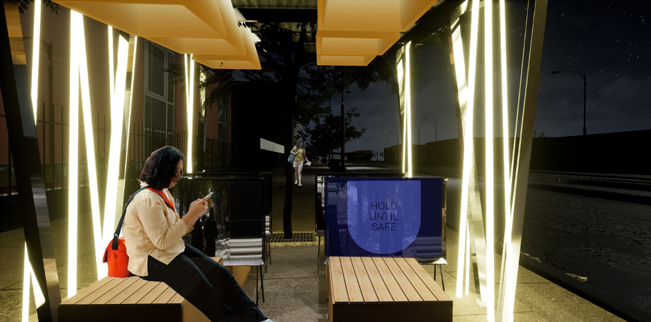
My master’s thesis, “Street Respect,” has profoundly resonated with audiences, striking a chord through its blend of intensive research, balanced narratives, facts, and visuals. The key to its success, I believe, lies in the equilibrium between storytelling and data presentation. Strategic highlighting of keywords offers viewers a quick grasp of the intent without needing to dive deep into the entire piece.
What particularly resonates is the use of animated GIFs that simplify complex facts into digestible design concepts. These visuals render the content approachable even for those not deeply versed in the subject. Additionally, rendered video shots enhance the storytelling, creating an immersive experience as viewers scroll through the project.
The success of “Street Respect” stems from its adaptable nature. It allows the audience to quickly understand the core ideas through highlighted keywords and visualizations or to explore in greater depth for a more comprehensive insight. This flexibility, combined with captivating visuals and storytelling, seems to have a significant impact on the audience.

Have you received any feedback from peers, mentors, or clients that led you to make changes or improvements to your online portfolio? Can you share some examples?
Feedback from mentors and peers has been crucial in refining my online portfolio. Their perspectives have been instrumental in ensuring my portfolio’s narrative accurately reflects my projects’ intentions. Additionally, I’ve had the chance to gain insights from design industry mentors about what professionals look for in potential candidates. Their advice extended beyond mere visual appeal, emphasizing the practical qualities valued in a candidate’s portfolio. This blend of aesthetic refinement and industry relevance has greatly enhanced the strength of my portfolio.
Lastly, how do you incorporate storytelling elements into your online portfolio to better convey the journey and process of your designs, not just the finished product?
Incorporating storytelling into my online portfolio involves a layered approach. I start with mind maps to brainstorm concepts, followed by flow charts and graphs to focus my design research. Photographic documentation supports this research, while initial sketches explore spatial possibilities. Sketch models then delve into materiality and form. Visual renderings are key in presenting the final product. My aim is to narrate the full journey of a design from its inception to realization, using these varied mediums. I’m committed to displaying the iterative process, illustrating how each stage shapes the evolution of the final product. This method allows viewers to comprehend the depth of my design process, appreciate its nuances, and understand the meticulous effort behind the finished work.
It has been a privilege to share this insightful journey through the lens of a visionary designer. This interview not only highlights a portfolio of remarkable projects but also sheds light on the creative process and dedication behind each piece.
We hope you’ve found inspiration in these pages and invite you to keep exploring the fascinating world of design, where every project tells a story of innovation and passion.