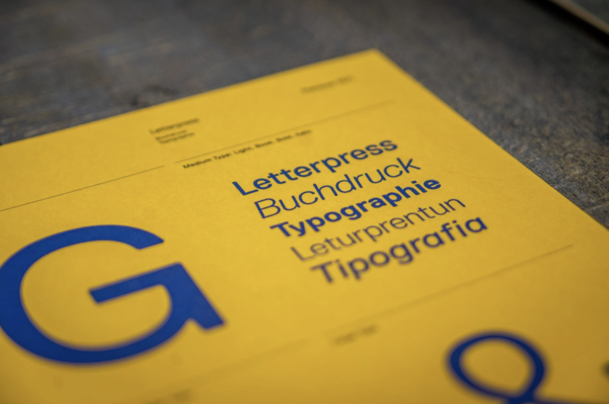
Fonts can be important to a brand’s identity, but when you’re trying to deliver a custom website design, it is much more vital that you make sure that your website’s primary font remains consistent across multiple interfaces.
While most websites are typically designed with a fallback when a font fails to load in an interface, the font used as a fallback can be pretty different from the chosen font, which can impact your web design negatively if you fail to accommodate for the possibility of this change from your initial design.
Let’s say you don’t have nor plan to have your own brand-associated font and typeface. You’re just going to use Helvetica for your web design. Surprise: Helvetica isn’t a web safe typeface – the majority of your site visitors who use Windows or Android-based systems are going to get the fallback font instead.
So, what’s the best way to deal with this? Find a web safe font that suits your website in the first place. There is actually quite a handful that works across multiple browsers and devices – here are five of the most popular amongst them.
Table of Contents
Tahoma
The Tahoma typeface is part of the sans-serif family, alongside heavyweights such as Arial and Verdana. Also made by the Microsoft Corporation, Tahoma differs from the rest of its siblings due to its tighter letter spacing and thinner body. This typeface is suitable for multiple site types, ranging from official government websites to e-commerce, considering it is relatively neutral. Some examples of famous websites that use Tahoma as their primary typeface are the Russian social media VK and the Chinese online shopping site Taobao.
Tahoma is a TrueType font – what this means for your web design is that it typically shows up well in any screen resolution. Using this font can significantly help with ensuring that your website’s display remains consistent across multiple devices. There is one downside to this font, however: Tahoma does not load in devices that run Linux systems without additional installations on the user side. To counter this, it’s best to include a fallback font family to ensure that your web design should remain mostly consistent across devices.
Georgia
Georgia hails from the same font family as Times New Roman, but it does give off a different vibe from the latter, perhaps due to its larger letter size compared to Times New Roman and the letter’s thickness even without additional modification to the font-weight or boldness. The style of this typeface is reminiscent of Scotch Roman, a once-popular 19th-century typeface.
Georgia can be an excellent option for websites that are slanted more towards businesses that are trying to exude a formal and professional feel in their sites. A great example of a website that uses Georgia is The New York Times. As another TrueType font, Georgia is fairly flexible across devices of various resolutions.
Courier New
If you’re using a Windows operating system, you may have encountered this font whenever you’re typing something in your Notepad application. Courier New is pretty commonly found on the Internet, though rarely on the side of the user interface. As part of the monospace font family, Courier New has one of the widest letter spacing and shortest letter sizes in comparison to other monospace fonts. This is why it is prevalent amongst websites related to programming.
However, Courier New is not the easiest typeface to use for text-heavy websites. Coupled with its rather extremely thin letters in normal stylings, the use of Courier New for your web design should be done sparingly and with consideration of who your site visitors would be.
Lucida Console
Lucida Console is one of the many typefaces that are included in the Lucida typeface group, which encompasses multiple font families. Lucida Console itself is considered as part of the monospace font family and used to be the typeface you see when you string up letters in your Notepad application.
As with other monospace, Lucida Console can be difficult to read for text-heavy websites, so if you decide to use this font, consider using it for headers or sub-headers and not making it the default for paragraph texts.
When determining the most suitable typeface for your website, always prioritize finding a typeface that would provide the same experience to your visitors. The best way to do this is by choosing a typeface that is considered web safe. Web safe fonts range from various font families – and the options mentioned above should help you in choosing one that could still represent your website’s brand despite prioritizing a user-friendly web experience.